Button Positioning Guidelines
The following guidelines show how to include "Simpler Quick Buy" button within your online store.
Best practices
When you integrate with the Simpler module, various scenarios can occur that are dependent on your website, app buy flow, and user experience (UX). To improve the UX, consider the following guidelines:
- Optimize for minimal clicks
- Recommended placements for Simpler button
- Enable “Accepted cards” option
Recommended placements
To get the best results, you must add Simpler's "Quick Buy" button on the following placements:
- Product page
- Mini cart (View cart)
- Cart page
- Checkout page
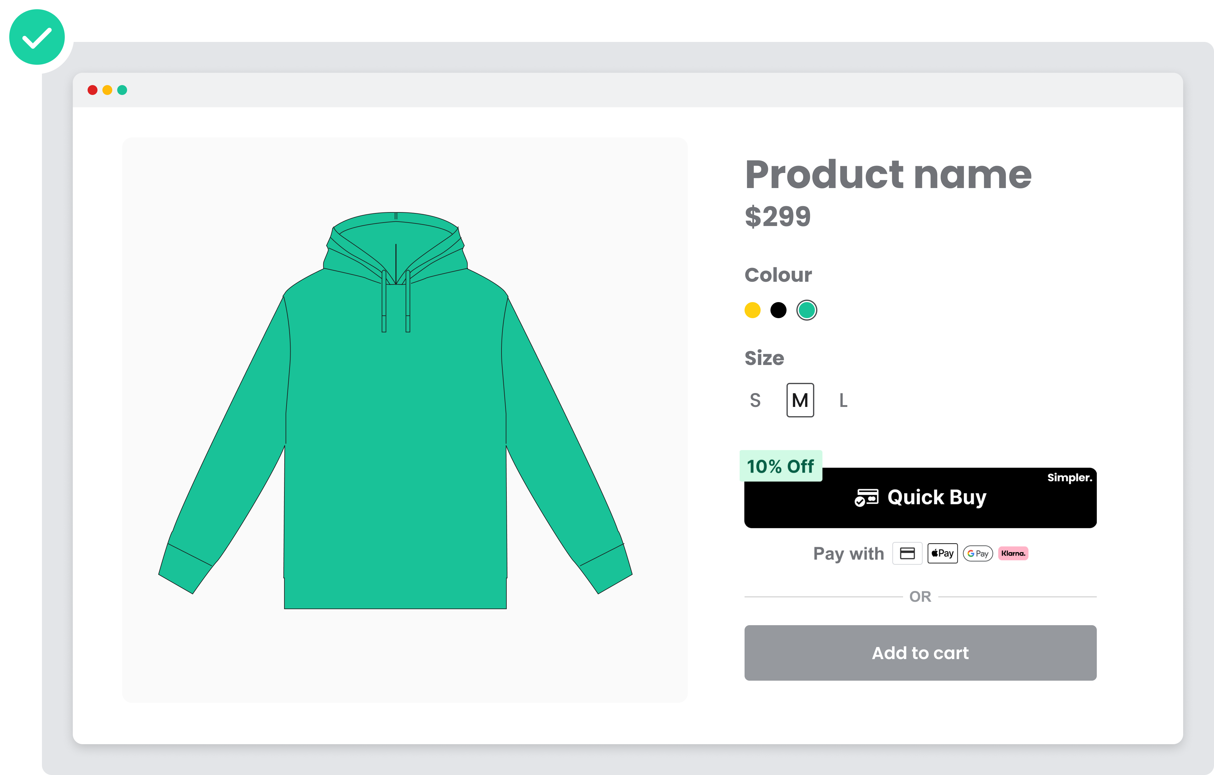
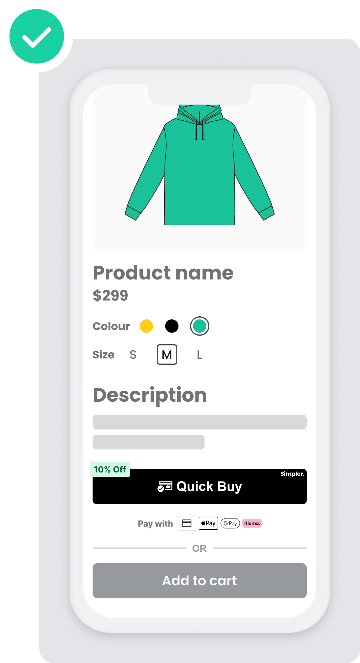
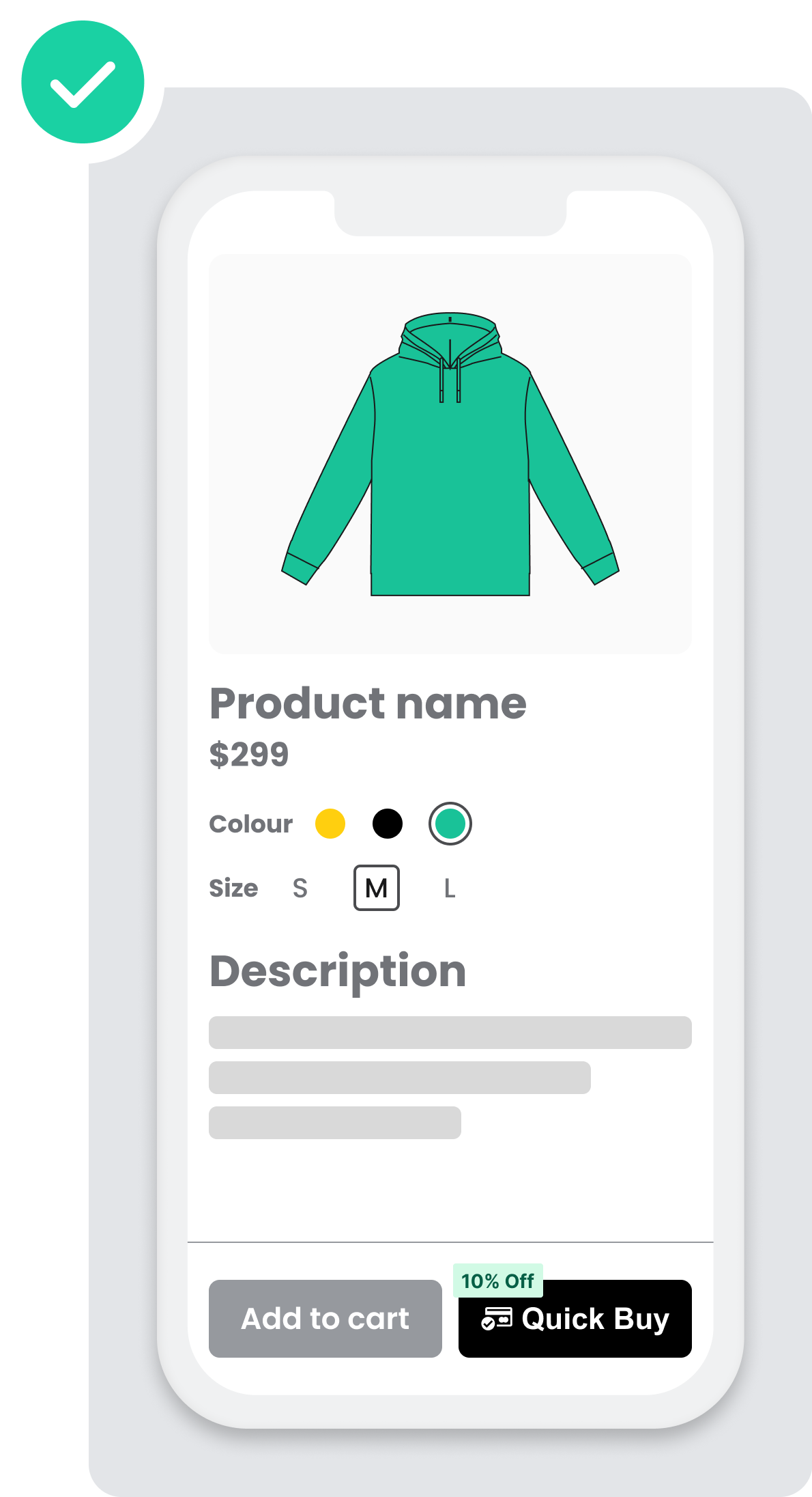
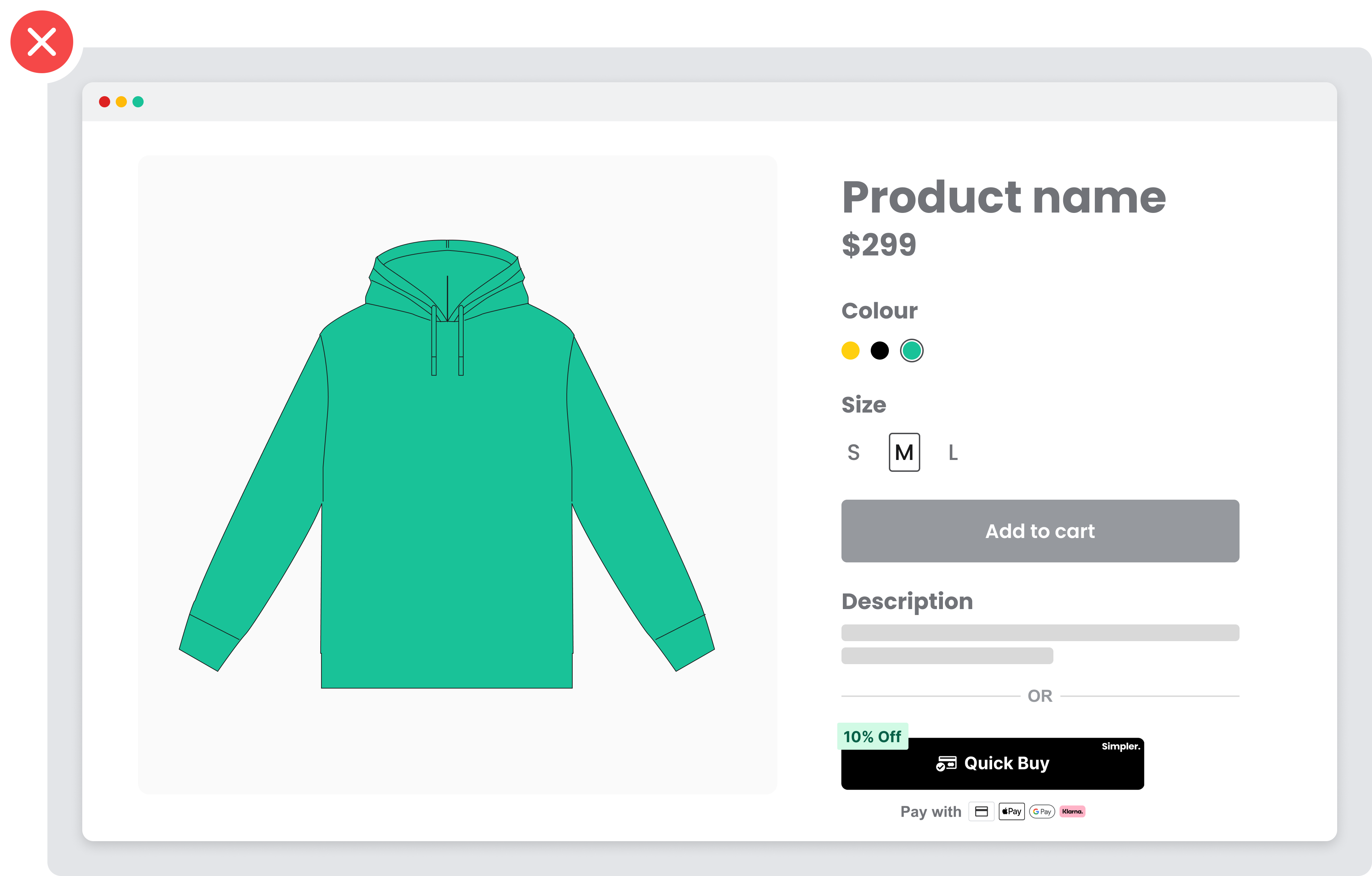
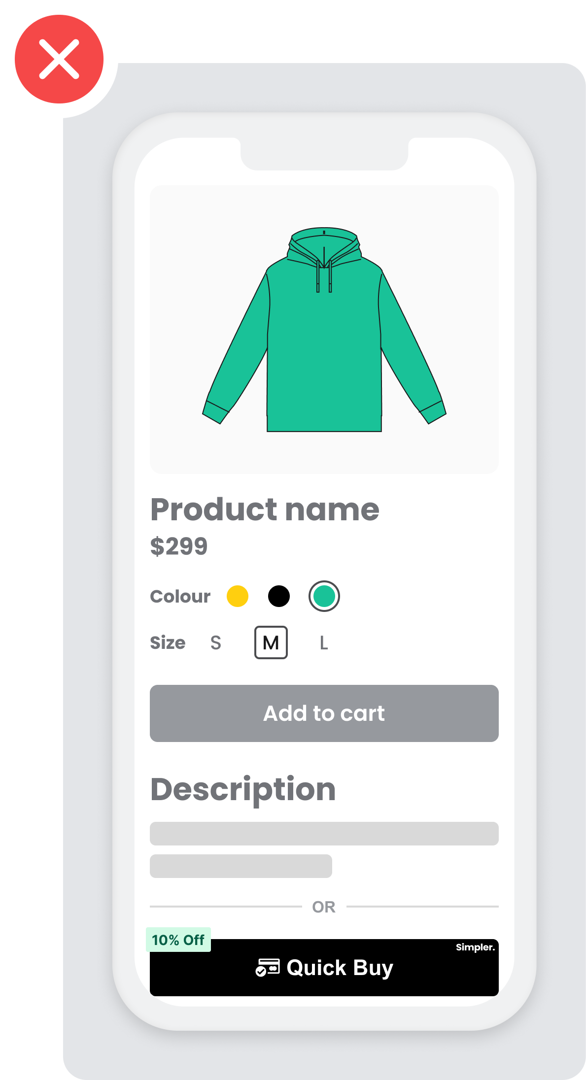
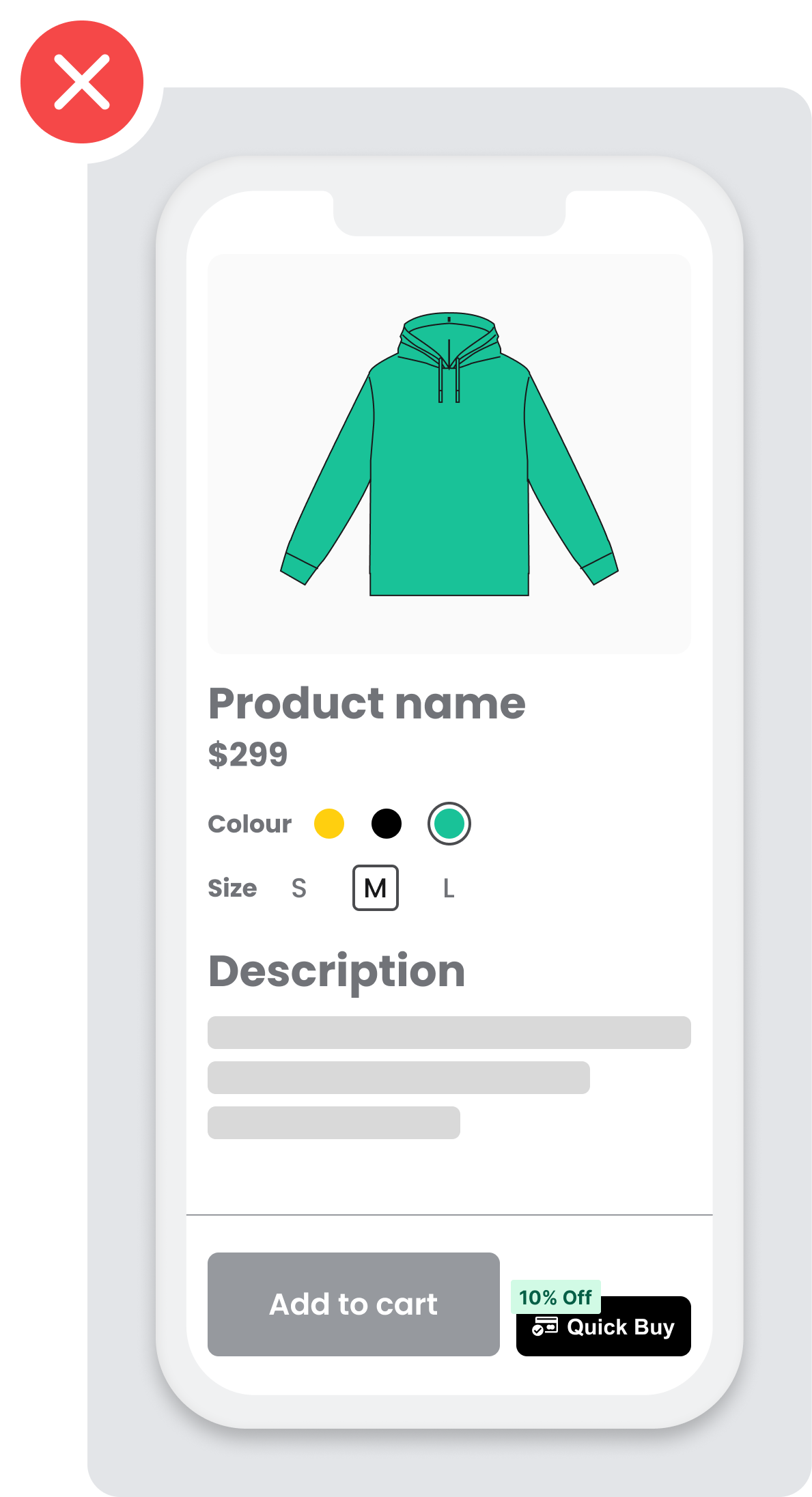
Product Page
Add Simpler button to your item or product pages, and enable quick checkout for your customers. This reduces the number of checkout steps and increases conversion rates on single-item purchases.
Place the Simpler button above “Store availability” and/or “Add to Cart” as well as reduce spacing between the buttons to make it appear above the fold and more accessible with less scrolling time via mobile. Otherwise, most mobile users will not be able to see if when landing at the product page.
DO: (Good example ✅)
DONT: (Bad example ❌)
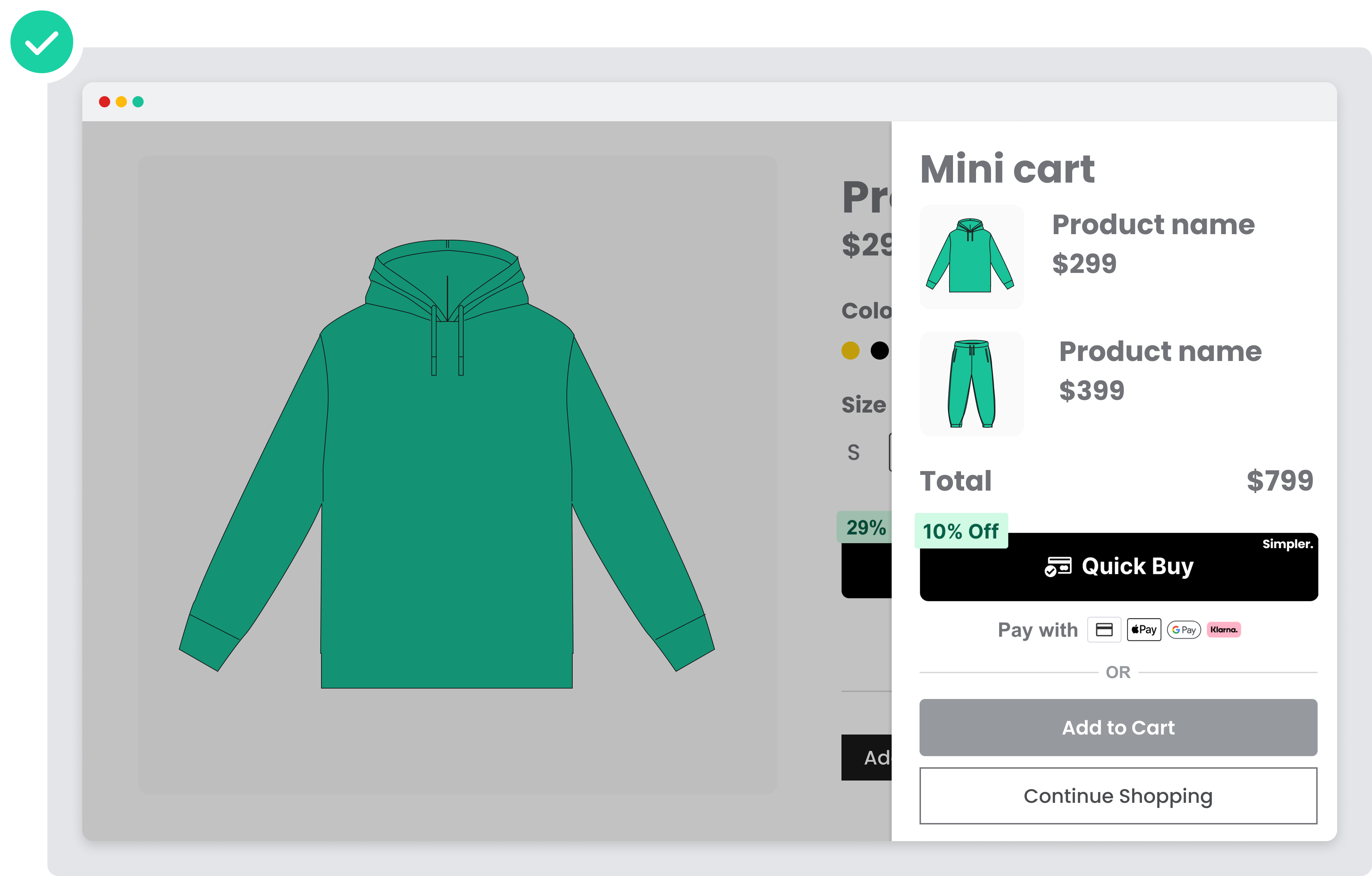
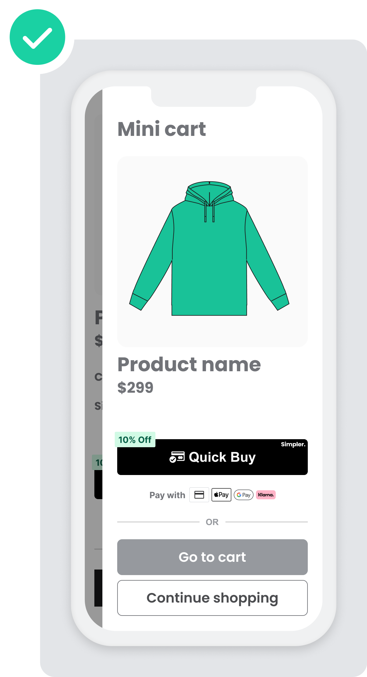
Minicart
- Mini cart (View cart) is the most popular placement and the most converting one according to our internal data, analyzing hundreds of merchants and thousands of shoppers. It’s highly recommended that the Simpler checkout button is included in this step of the funnel.
- Lack of Simpler button in this position will prevent shoppers to check out with the intention of buying more than 1 item.
When you choose this Simpler button placement, you can offer the customer the following improvements:
- A convenient view of all items in the cart
- A final and total associated price
- The ability to check out immediately
Example
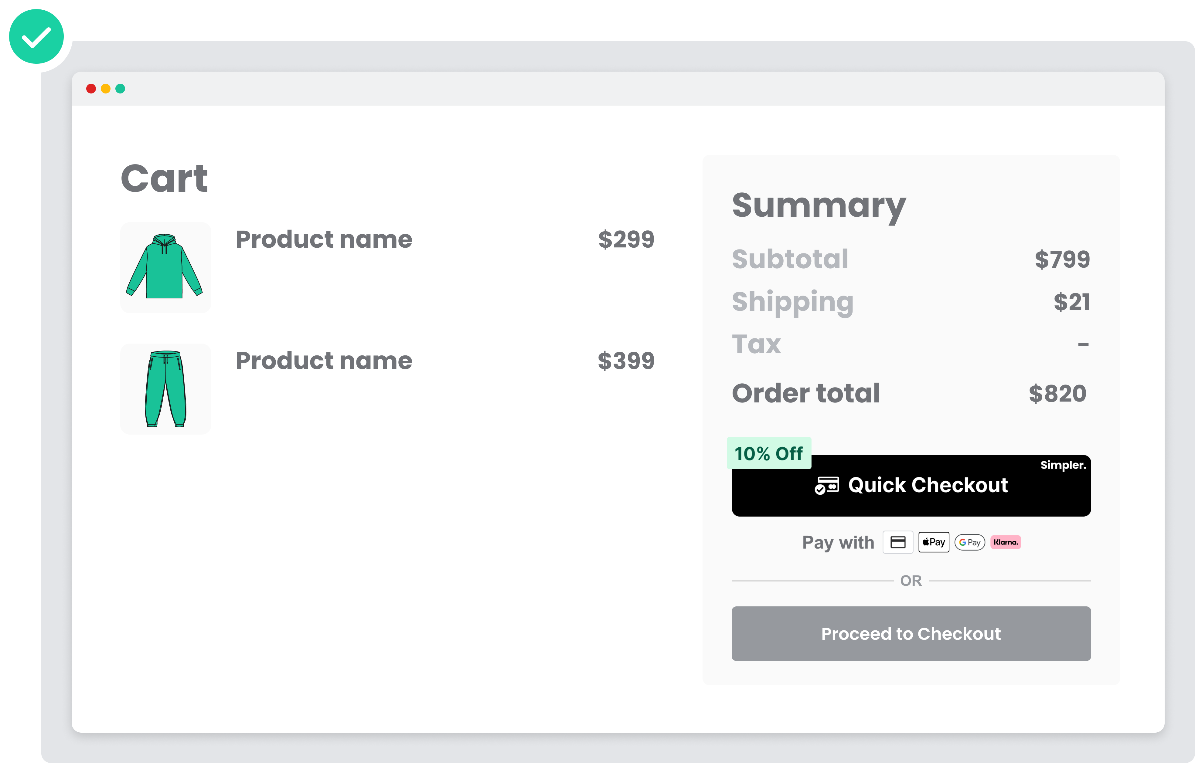
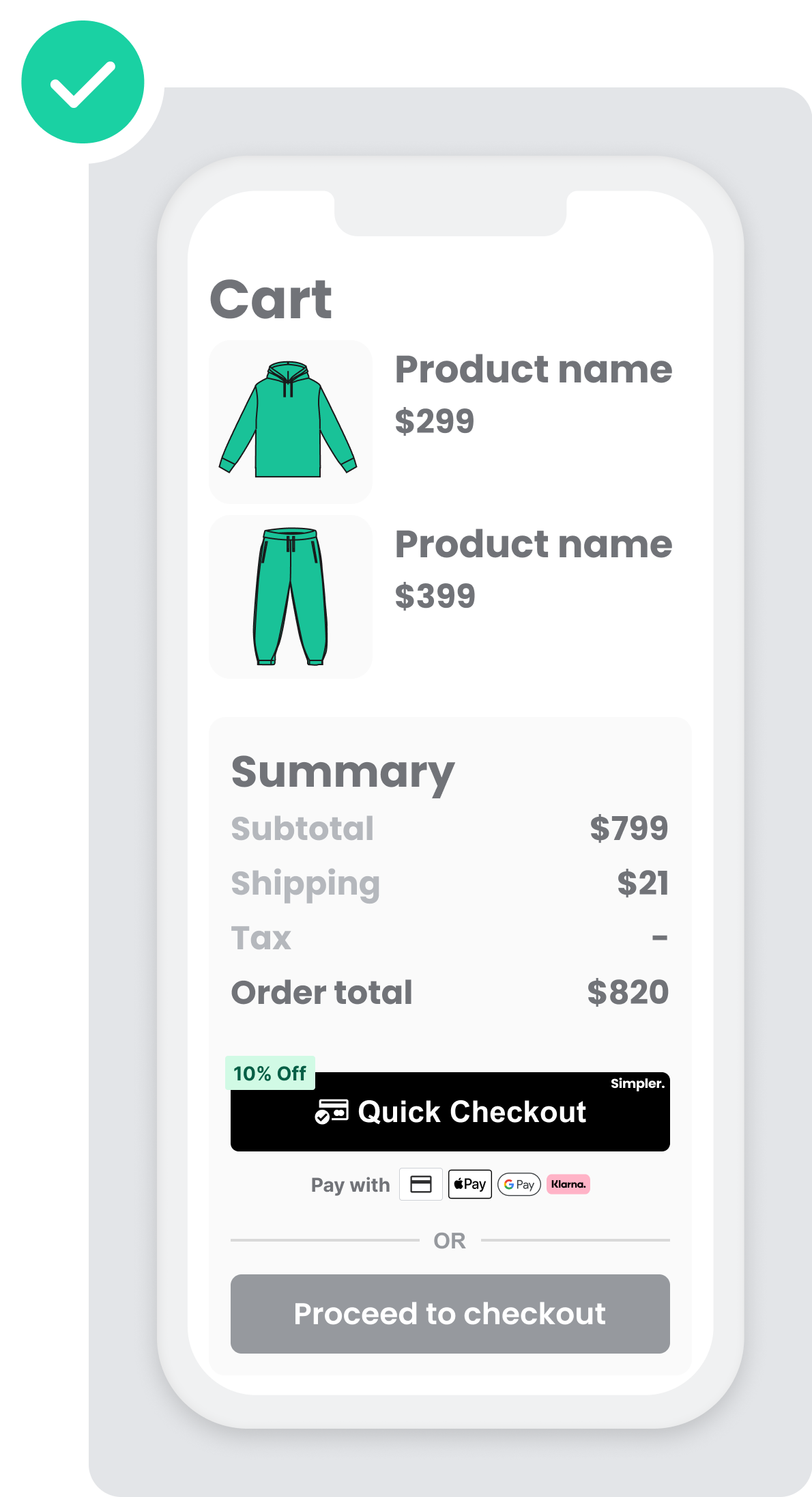
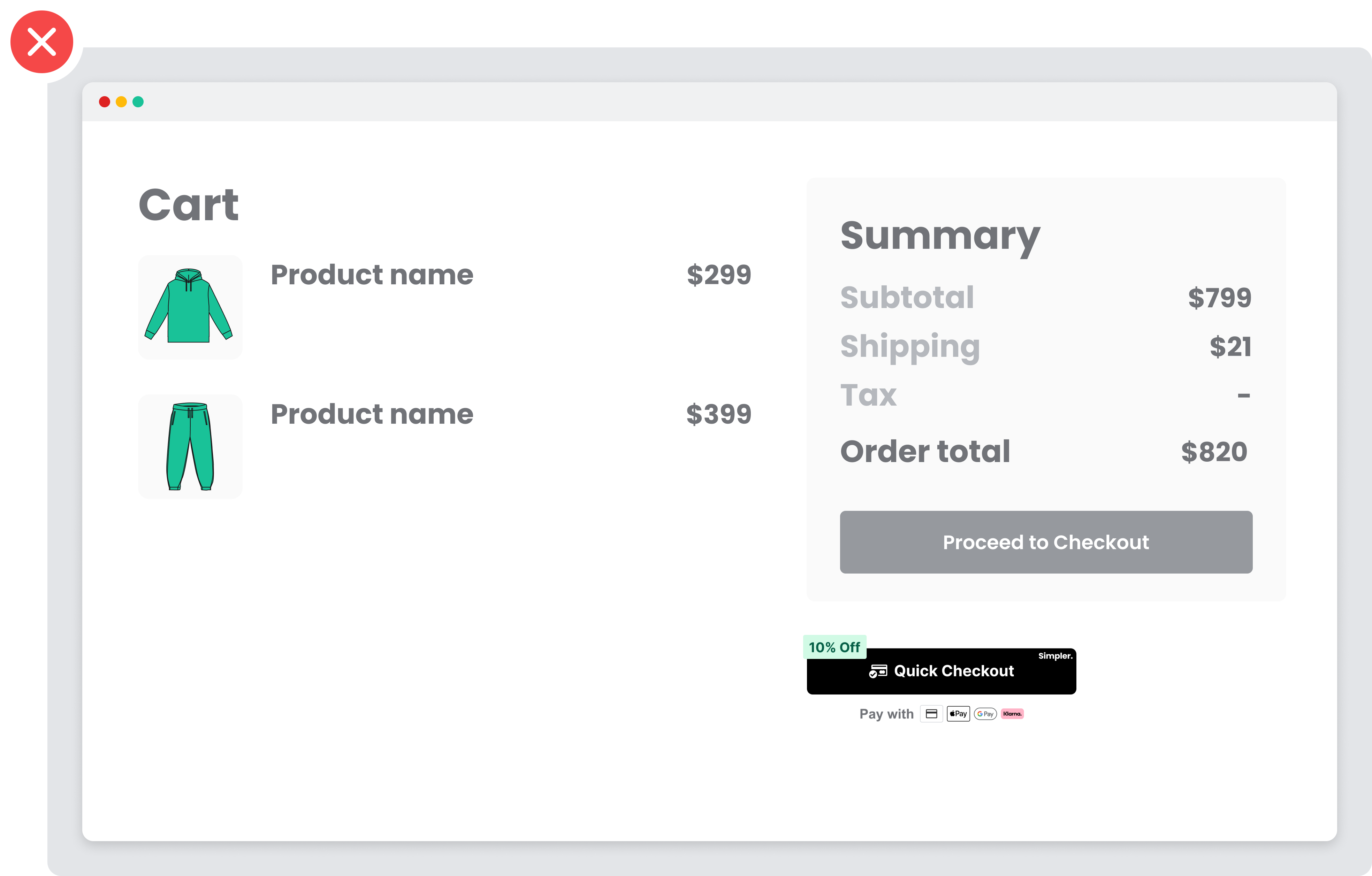
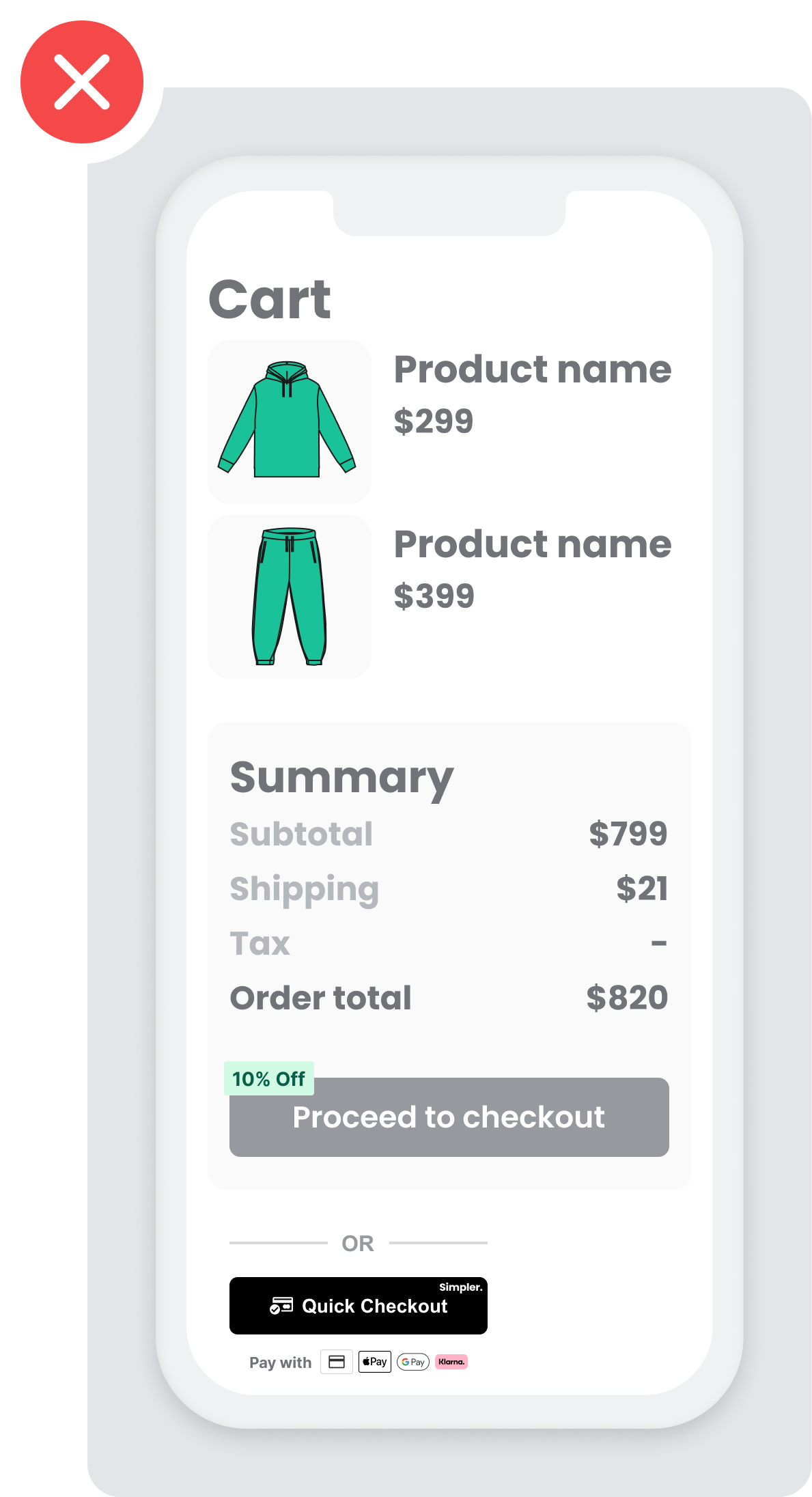
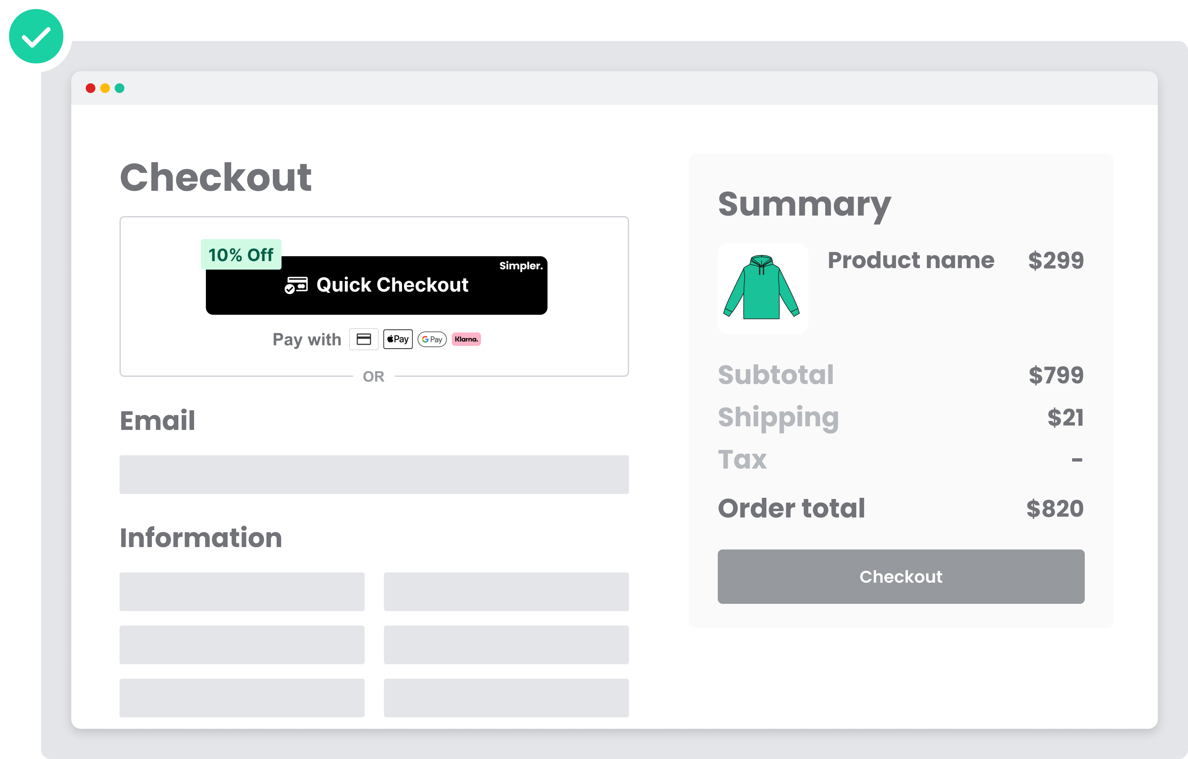
Cart Page
- It’s highly recommended to place the Simpler button above the “Proceed to Checkout” CTA in order to offer optimal exposure for mobile users.
If you have a Checkout or Cart button, add Simpler’s “Quick Buy” or “Quick Checkout” button near the standard checkout option.
When you choose this Simpler’s “Quick Buy” or “Quick Checkout” button placement, you can offer the customer the following improvements:
- A convenient view of all items in the cart
- A final and total associated price
- The ability to check out immediately
DO: (Good example ✅)
DONT: (Bad example ❌)
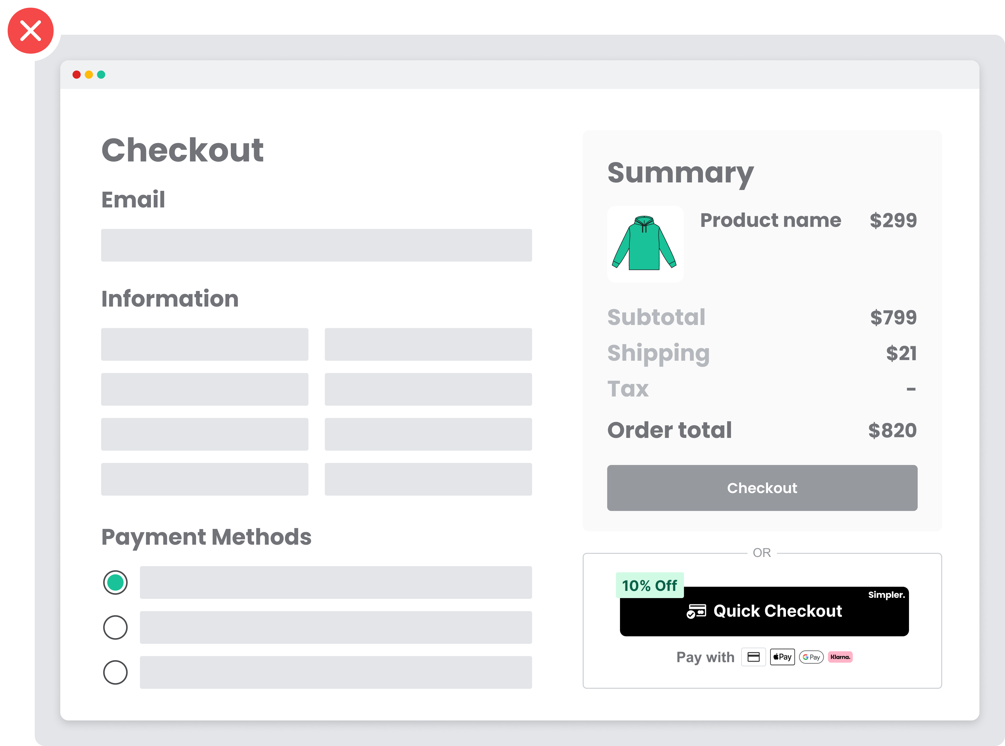
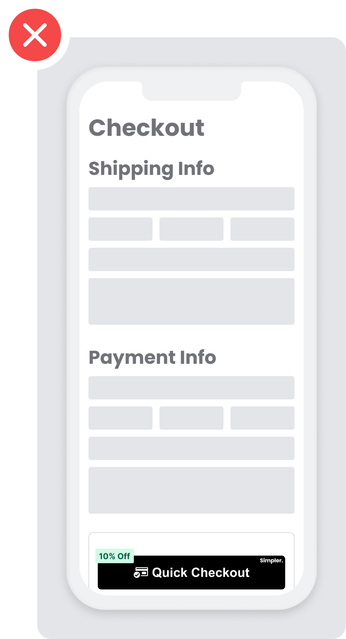
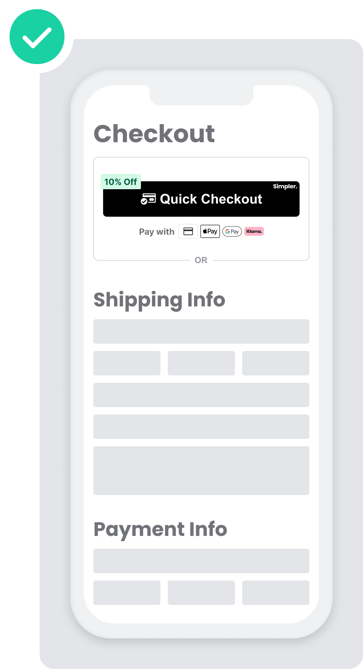
Simpler Button on the Checkout Page
- The checkout page is a very popular placement, especially for mobile, since it’s an alternative for shoppers to skip filling all their details in the website’s long and tedious checkout form. It’s recommended that it’s added here as well.
- Button placement should be ABOVE the merchant’s traditional checkout and before shoppers enter their personal information and shipping details. The main reason is that mobile users will have to scroll all the way down for the option to 1-click check out, which highly jeopardizes the Quick Checkout experience.
If you have a Checkout or Cart button, add Simpler’s “Quick Buy” or “Quick Checkout” near the standard checkout option.
When you choose this Simpler’s “Quick Buy” or “Quick Checkout” placement, you can offer the customer the following improvements:
- A convenient view of all items in the cart
- A final and total associated price
- The ability to check out immediately
DO: (Good example ✅)
DONT: (Bad example ❌)